Skærbæk Fan Weekend/MOC Ideas
A few weeks ago, my wife and I started planning a trip to Europe for fall, with plans to go to Skærbæk Fan Weekend in Denmark, along with a trip to Paris, France…At this point, we’re still planning on going. Despite my wife’s objections, I’m planning to take a MOC, with the requirement being, easy to cary in an overhead bag… Throw into this crazy mix, we’ve really been impressed with LEGO Dots — mostly the vibrant colors, the the packaged bento-boxed designed sets.
In the back of my mind, I’m thinking about what to build… One thought was rehash the floating rock display, modify the base (so it’s easier to pack), add more rocks, do a suspended bridge between rocks, add more organic elements, maybe a few floating rocks with castle ruins on top (like a remains of a tower)… To be honest, I haven’t totally discounted this idea. I feel like the display needs the built out more to enrich the story.
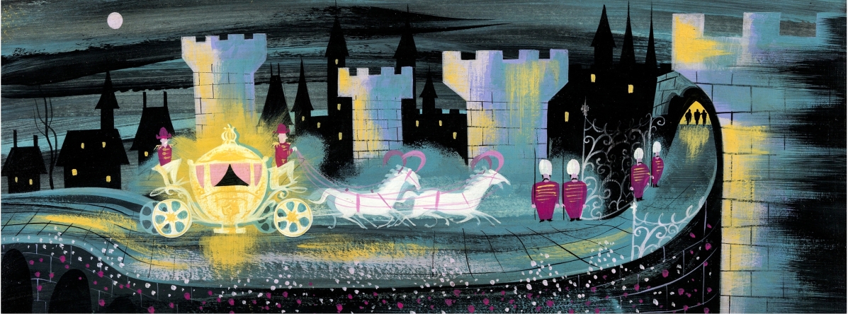
However another idea I’m thinking about is a tribute sculpted mosaic to Mary Blair. Something that’s no thicker than 4-5 inches, built on several half baseplates (12×32), figuring it might end up bing about 84×32 studs… Still noodling on this one, but able to capture some of her wide images like this:
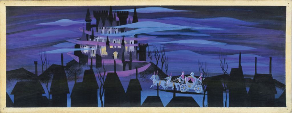
Or like this:
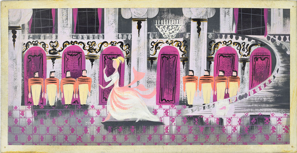
The ones I’ve been looking at are from Cinderella, obviously… I’ve been looking at images from Alice in Wonderland that are just as rich, with more greens and florals. I’m thinking about mixing in minifigs or Friends-dolls, minifig sized horses/architectural pieces, Playing with depth, color… maybe skewing the visuals out towards the viewer (say in the above, building out the steps to the staircase in tile, making the dance floor at a skewed angle, adding a little depth to the balcony above the dance floor, take a little liberty in sky colors behind the glass windows, etc.).
The more I look at the above image, I wonder if it hasn’t been chopped down from a larger/longer image… In the image above, with the carriage arriving at the castle; I’ve found the same image, but cropped smaller, where the three house tops on the right hand side and the one house on the left hand side were cropped out… At first glance, I discounted the cropped image because it didn’t look “balanced”… The ballroom feels a little unbalanced as well, like there should be more on the right hand side… but that could just be me.
I love visual elements in all three images in this post, the colors are dark and rich. There’s a forth image that I didn’t include that had the carriage glowing in gold/yellows/whites casting sickly-greens on the buildings it was driving in front of… I have different shades of purples and pinks, a stash of pale yellows, dark blues… I think my next step is to do some sketches, figure out how I’ll connect the “panels” together and skewing some of the elements towards the viewer…